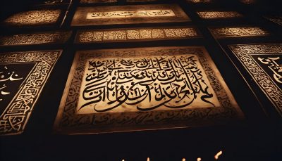
Islamic calligraphy, with its intricate beauty and spiritual depth, has captivated hearts and minds for centuries. At the heart of this art form lies a profound appreciation for symmetry, proportion, and harmony. One of the key principles guiding the composition of Islamic calligraphy is the Golden Ratio, a mathematical concept that has been revered across cultures for its aesthetic appeal and divine significance. In this article, we will explore the use of the Golden Ratio and geometry in Islamic calligraphy, shedding light on how these principles shape the formation of letters and the anatomy of this sacred art.
The Golden Ratio in Islamic Art:
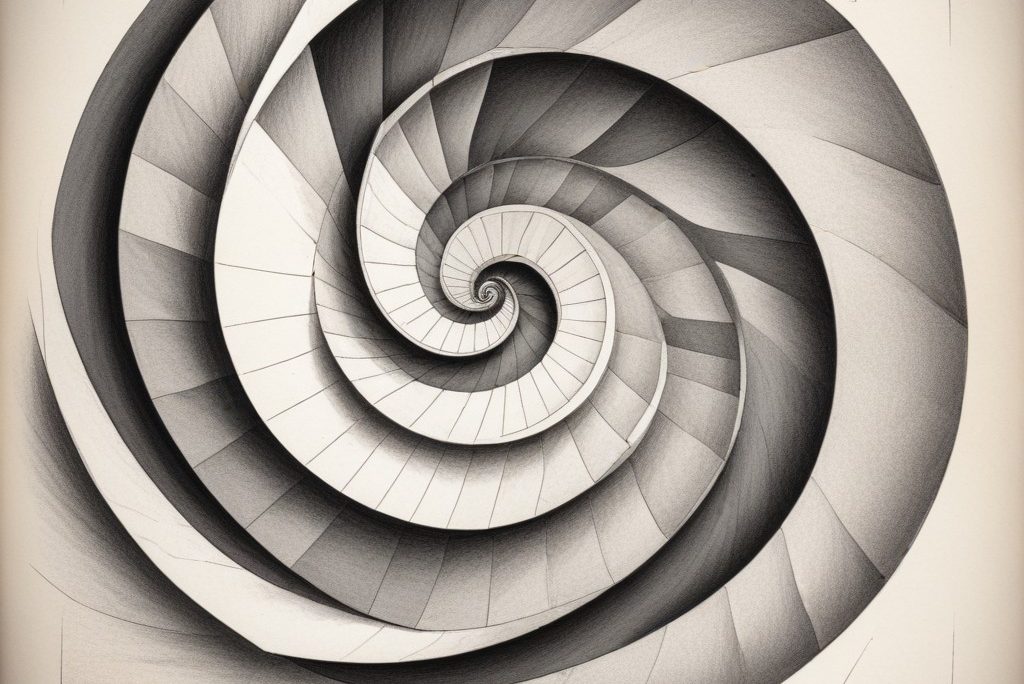
The Golden Ratio, also known as the Divine Proportion or Phi (φ), is a mathematical ratio of approximately 1.618, found in nature, architecture, and art. In Islamic art and architecture, the Golden Ratio is revered as a symbol of divine harmony and perfection. It is believed to reflect the inherent order and beauty of the universe, echoing the principles of balance and proportion found in Islamic theology.
In Islamic calligraphy, the Golden Ratio serves as a guiding principle in the design and composition of letters, ensuring a harmonious balance between form and space. Calligraphers employ geometric techniques to construct letters according to precise proportions, with careful attention to symmetry and rhythm. By adhering to the Golden Ratio, calligraphers achieve a sense of unity and coherence in their compositions, elevating them to a higher aesthetic plane.
Geometry in Islamic Calligraphy:
Geometry plays a fundamental role in the creation of Islamic calligraphy, providing a framework for the intricate patterns and motifs that adorn the written word. Calligraphers utilize a variety of geometric shapes, such as circles, squares, and polygons, to construct letters and decorative elements with precision and accuracy. These geometric principles govern the placement of strokes, the spacing between letters, and the overall layout of the composition.
One of the most common geometric constructions in Islamic calligraphy is the use of circles and arcs to form letters. Calligraphers often begin by inscribing a circle or series of circles to establish the basic structure of a letter. From there, they use a combination of straight lines and curves to define the shape and proportions of each letter, ensuring a graceful and harmonious design.
Common Angles and Anatomy in Islamic Calligraphy:
In addition to geometric constructions, Islamic calligraphy also follows certain principles of anatomy and angle formation. Calligraphers are trained to observe specific angles and proportions when creating letters, ensuring consistency and uniformity in their work.
For example, the angle of the pen nib relative to the writing surface plays a crucial role in determining the thickness and slant of each stroke. Calligraphers typically use a pen angle of approximately 30 to 45 degrees when writing in scripts such as Thuluth or Naskh, producing elegant and balanced letterforms.
Furthermore, the anatomy of each letter is carefully constructed according to a set of prescribed proportions. For instance, the height of the letter “aleph” in Arabic script is often divided into segments based on the Golden Ratio, with the upper portion representing one-third of the total height and the lower portion representing two-thirds. This division creates a sense of visual harmony and proportion, enhancing the overall aesthetic appeal of the composition.
In conclusion, the Golden Ratio and geometry are integral components of Islamic calligraphy, guiding the design and composition of letters with precision and grace. By adhering to these principles, calligraphers create works of art that transcend the written word, embodying beauty and divine harmony of Islamic culture.